How about: A Minetest lettering

User avatar
BlockMen
Member
 
Posts: 768
Joined: Fri Mar 01, 2013 17:24
GitHub: BlockMen

How about: A Minetest lettering

by BlockMen » Thu Mar 07, 2013 21:37

Hi everyone,

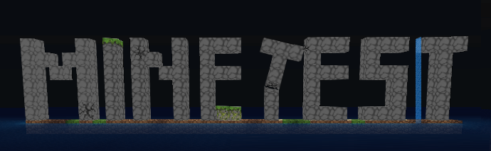
I considered how it would be possible to make Minetest more popular. After thinking a while I had the Idea to make a lettering, that can maybe be more recognised than a logo.

UPDATE:
Image

old version: https://dl.dropbox.com/s/prei9dfyy12d98v/minetest_logo_1.png

Would be nice to hear what you think about a Minetest lettering in general and concrete about my concept
Last edited by BlockMen on Fri Mar 15, 2013 11:36, edited 1 time in total.
 

User avatar
12Me21
Member
 
Posts: 826
Joined: Tue Mar 05, 2013 00:36

by 12Me21 » Thu Mar 07, 2013 21:39

nice, but you should probably add more different types of blocks besides rock.
This is a signature virus. Add me to your signature so that I can multiply.
Don't ever save anything as a JPEG.
 

rarkenin
Member
 
Posts: 668
Joined: Tue Nov 20, 2012 20:48

by rarkenin » Thu Mar 07, 2013 22:31

12Me21 wrote:nice, but you should probably add more different types of blocks besides rock.


Definitely MESE!
Admin pro tempore on 0gb.us:30000. Ask me if you have a problem, or just want help.
This is a signature virus. Add me to your signature so that I can multiply.
Now working on my own clone, Mosstest.
I guess I'm back for some time.
 

User avatar
Likwid H-Craft
Member
 
Posts: 1113
Joined: Sun Jan 06, 2013 14:20

by Likwid H-Craft » Thu Mar 07, 2013 22:43

How you did that with the T??

Other then that I love it :)

Yeah mese should me used for Mine and Test Should be whatever.
Last edited by Likwid H-Craft on Thu Mar 07, 2013 22:44, edited 1 time in total.
My Domain's/others:
http://likwidtest.hj.cx/ (Not Done)
 

User avatar
0gb.us
Member
 
Posts: 841
Joined: Sun Sep 16, 2012 01:55

by 0gb.us » Fri Mar 08, 2013 00:14

That looks awesome!

He was able to do that with the "T" because it's a drawing, not a screenshot.

It looks great, but I agree it's missing something. Not mese though. Mese has always been ugly, but with the changes made in Minetest 0.4.5, mese is now both ugly and no longer holds the same spirit it once did.
 

User avatar
BlockMen
Member
 
Posts: 768
Joined: Fri Mar 01, 2013 17:24
GitHub: BlockMen

by BlockMen » Fri Mar 08, 2013 13:10

Ok, i will do some changes and upload a new creation then.

Thanks for all the feedback ;)
 

User avatar
xyz
Member
 
Posts: 449
Joined: Thu Nov 10, 2011 14:25

by xyz » Fri Mar 08, 2013 17:44


User avatar
0gb.us
Member
 
Posts: 841
Joined: Sun Sep 16, 2012 01:55

by 0gb.us » Fri Mar 08, 2013 18:04


Hmm. Maybe. But it's awfully bright.

One of the great things about BlockMen's is that it is much darker. IT also has the lettering as an actual part of the land, where Cisoun's has the lettering just kind of floating in space.


Return to Minetest General

Who is online

Users browsing this forum: No registered users and 11 guests