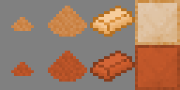
Are these textures "Bronze" enough - or are they too much red? They could also be somewhat oversaturated or the wrong color, which would need to be fixed. I believe they are fine; but I thought I should ask anyways, considering how important it is to most people that their Bronze should not have too much iron/steel in it, among other significant properties.
The color should not be made too close to yellow, because that color range is reserved for Brass, Aluminium Brass and Invar - those are somewhat different, because they have other colored metals which shift the total color in the opposite way, and thus are only having some amount of yellow and no orange.
Also, can anyone think of a good system which would facilitate ability of colorblind people to still be able to tell what the metal is when looking at the item texture? I could try to write the chemical formula in pixelated letters over the item-image part of the testure, but that would not look good at all, and it would result in problems with the formula of more complex alloys. I could use a grayscale contrast-based system, which would require each metal to be given a unique amount of "roughness", which would be based on how much "rough" the metal is relative to the others; similar to how each metal is required to be given a "false" color enhancement, so that people can quickly tell them apart, and realize which metal is in the ore they are seeing in the half-darkness of a cave or mining tunnel.